![]()
The new kid in the block has taken over the neighborhood and how! Apex Legends is the new console and PC based Battle Royale created by Respawn Entertainment and published by EA Sports. And with it’s advent, the Battle Royale market has been taken by storm, with the previous rulers of the market falling remarkable short in front of this giant.
Set in the Titanfall universe (but with the Titans), Apex Legends is a game where 20 squads, each comprising of 3 members, fight tooth and nail to become the last team standing in a gradually shrinking sci-fi induced map.
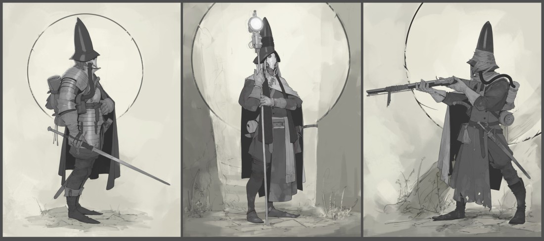
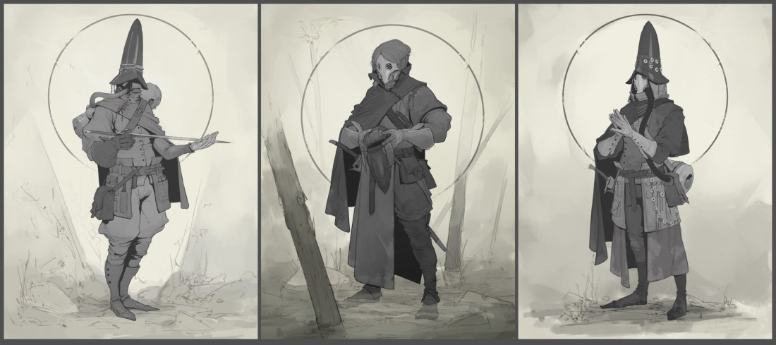
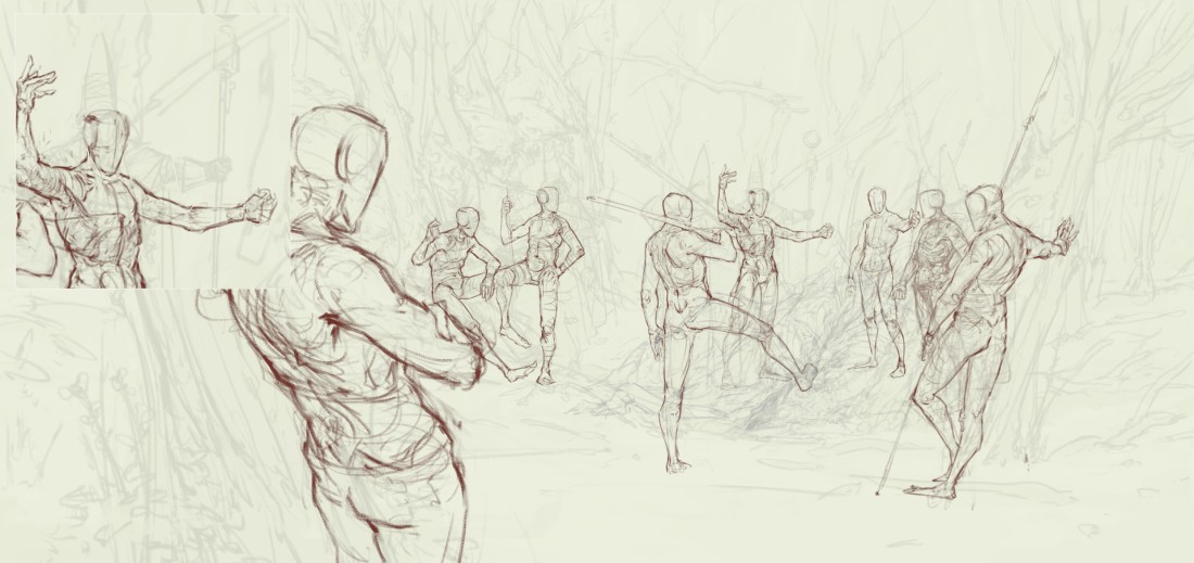
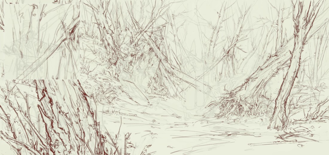
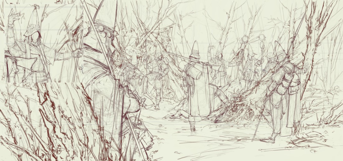
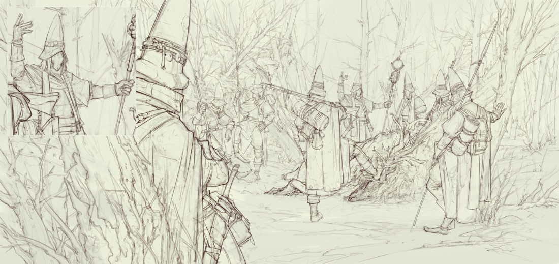
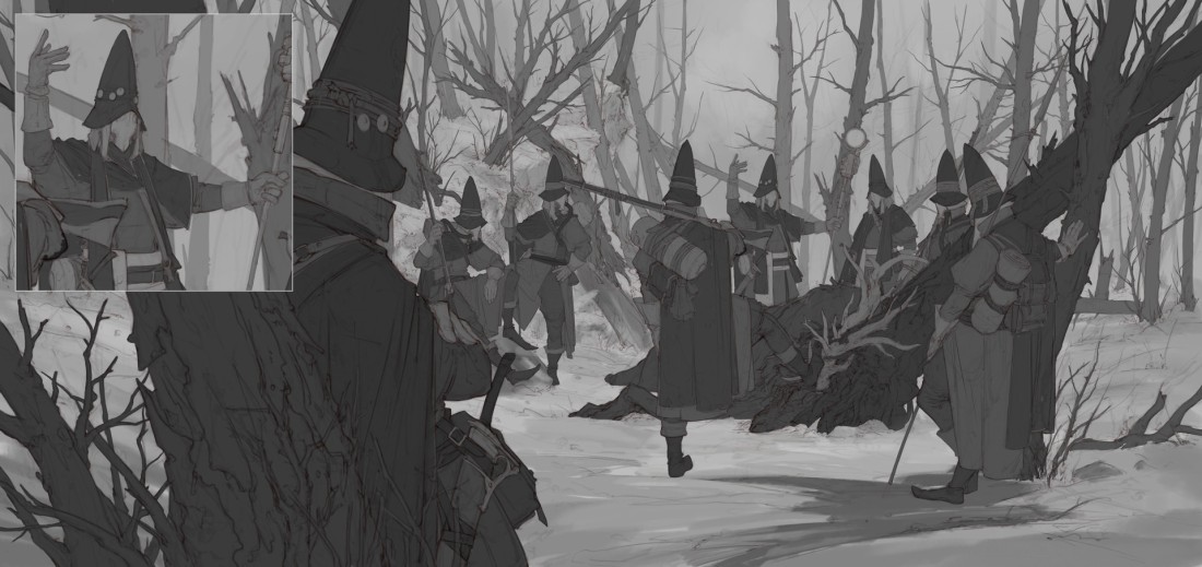
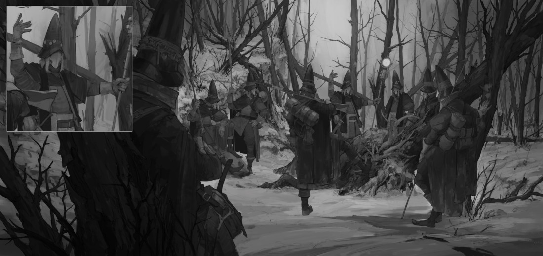
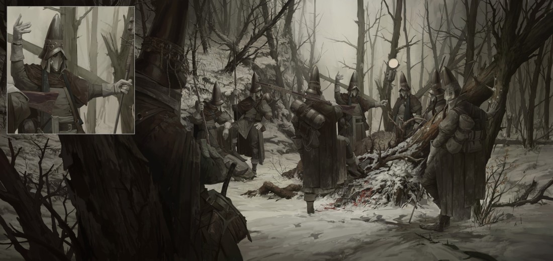
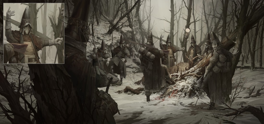
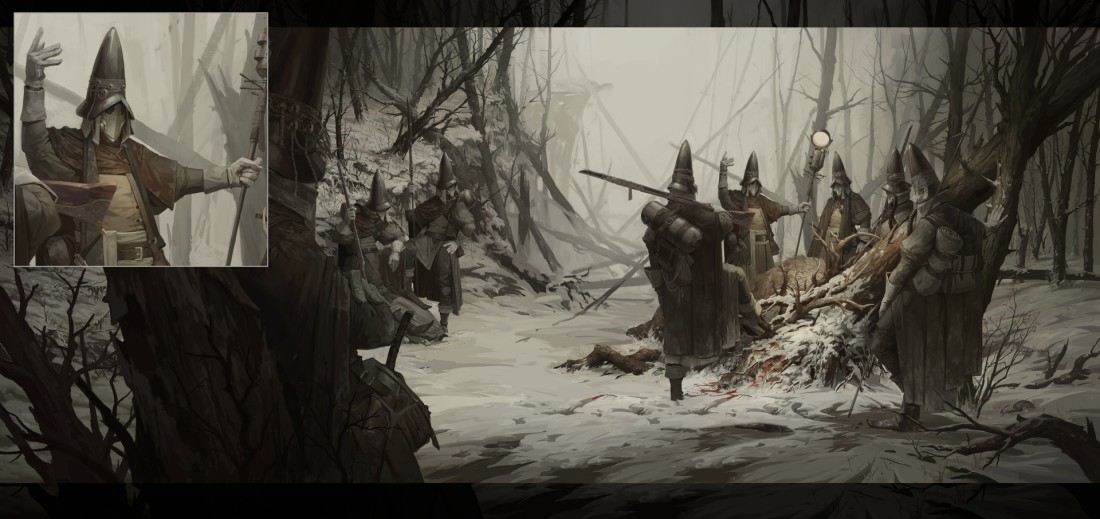
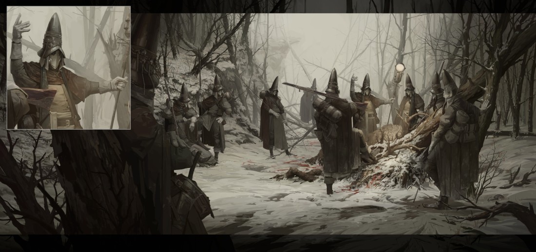
For us, Apex Legends stands out for the amazing visuals they have managed to create, an even greater feat considering this is ping-based battle royale. We took the time to sift through the concept art and 3D outputs which eventually makes this game so beautiful. Through this article we also congratulate the team at Respawn Entertainment and everyone else who worked in making this game the visual treat that it is.
1) Concept Art – Characters


2) Concept Art – Environments


3) Concept Art – Props and Weapons


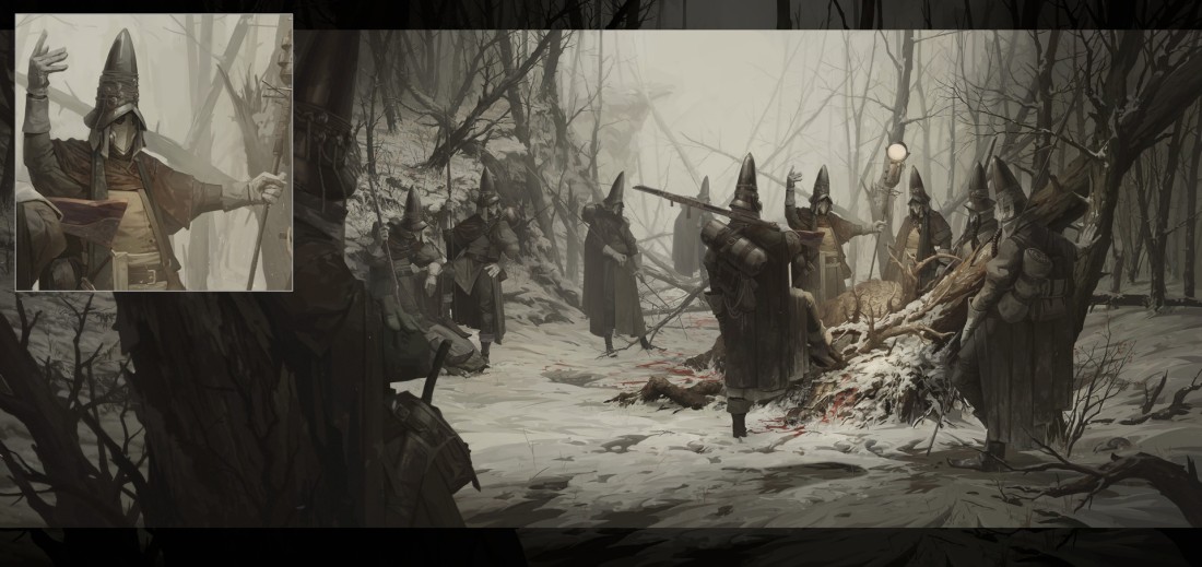
4) Illustrations


5) 3D Renders – Characters


6) 3D Renders – Props and Optics


7) 3D Renders – Weapons


8) 3D Renders – Environments


Artist List:
1) Concept Art – Characters
Kejun Wang – https://www.artstation.com/kejun66
Liam MacDonald – https://www.artstation.com/liammacdonald
Prop Wang – https://www.artstation.com/progwang
2) Concept Art – Environments
Danny Gardner – https://www.artstation.com/dannygardner
Jung Park – https://www.artstation.com/jungpark
Liam MacDonald – https://www.artstation.com/liammacdonald
Tu Bui – https://www.artstation.com/2buiart
3) Concept Art – Props and Weapons
Danny Gardner – https://www.artstation.com/dannygardner
Kejun Wang – https://www.artstation.com/kejun66
Prop Wang – https://www.artstation.com/progwang
Tu Bui – https://www.artstation.com/2buiart
4) Illustrations
Autumn Rain Turkel – https://www.artstation.com/arturkel
Campbell White – https://www.artstation.com/campbellwhite
Liam MacDonald – https://www.artstation.com/liammacdonald
Luca Xu – https://www.artstation.com/lucaxu
Tu Bui – https://www.artstation.com/2buiart
5) 3D Render – Characters
Dixing Sun – https://www.artstation.com/dixingsun
J Hill – https://www.artstation.com/jhill
Patrick Yeung – https://www.artstation.com/patrickvdk
6) 3D Render – Props and Optics
Brooke Olson – https://www.artstation.com/brookeolson
Eric Simard – https://www.artstation.com/ericsimard
Kevin Neal – https://www.artstation.com/artwork/VdG954
Paul Tran – https://www.artstation.com/paultran
7) 3D Render – Weapons
Alessandro Giulianelli – https://www.artstation.com/giulianelli
Brad Allen – https://www.artstation.com/magnethead
Corwin Paradinha – https://www.artstation.com/corwin
Eric Simard – https://www.artstation.com/ericsimard
Kevin Neal – https://www.artstation.com/artwork/VdG954
8) 3D Render – Environments
Brooke Olson – https://www.artstation.com/brookeolson
Marcos Shih – https://www.artstation.com/mshih
Paul Tran – https://www.artstation.com/paultran
Tragan Monaghan – https://www.artstation.com/tragan


")


")


")

")


")
")
")


")
")
")

")
")
")
")
")
")
")
")

")
")


")


")
345")


")


")


")


