The Illustrations of Nesskain Hks

For the longest time, Nesskain Hks has remained a very big influence on my life and career as an artist. He puts together a mesmerising concoction of flow-y, yet edgy, lines, dynamic postures, enthralling compositions and stunning portrayal of light in his colours. His larger than life portrayal of his subjects, and his handling of warm and cool ambiences, makes him an extremely talented illustrated and, for me, spearheading the international industry of Entertainment Illustrations. (Also, till very recently, I believed Nesskain to be from Europe considering his illustrative style and the colour communication he uses. But it so happens, he is Asian!)

Nesskain has a whole arsenal of projects in his belt, ranging from popular culture representations to anthropomorphic and original characters. He has created worlds, and some unique sentiments flowing through those worlds. His work creates the feeling of nostalgia, struggle and an overall attraction towards what he is capable of demonstrating to his audiences.

Here’s a look at Nesskain’s beautiful work, project-wise –

1) Cafe Rouge

These illustrations, titled ‘Cafe Rouge’ portrays a character Nesskain has drawn plenty of times in his personal works. Known by his fans as just ‘The Bearded Man’, Nesskain has portrayed him with his partner. Not only are these illustrations beautiful and creates a beautiful dance between warm and cool colors, but also, portray a very romantic and heart-felt relationship.

Nesskain’s colours are a number of steps ahead of simple cell-shading, and yet, there are visible patches of fixed colours, which ofcourse blend into a magnificent image, and that too, pretty seamlessly. His bold application of highlights only adds to the effect. The environment created around the characters doesn’t at any point shift the focus from the characters. The buildings, greenery and the people are either blurred out or lack the saturated colours of the main characters, thus adding to the balance of the illustrations.
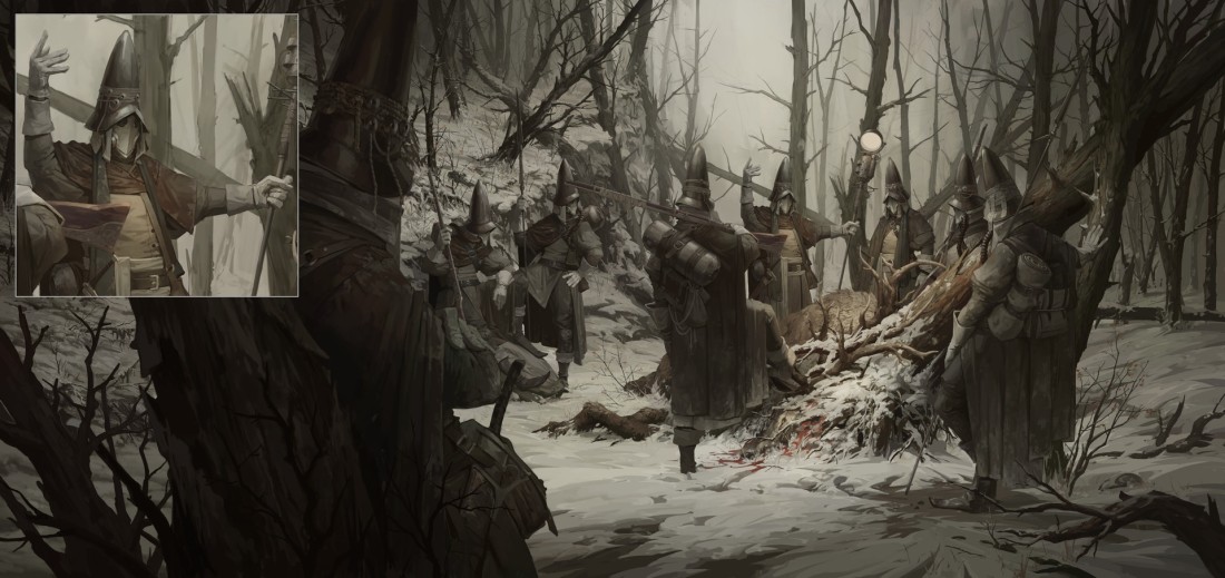
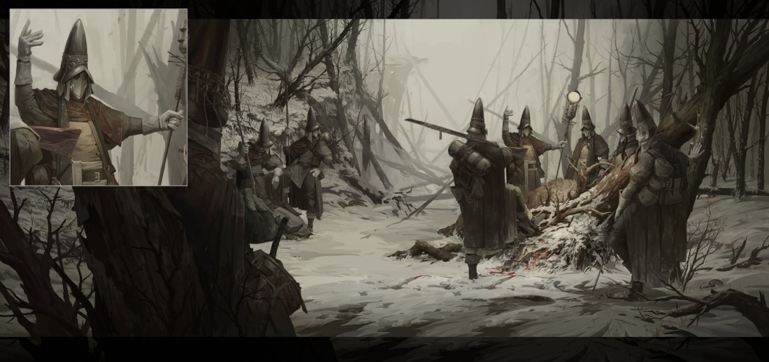
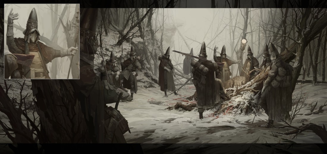
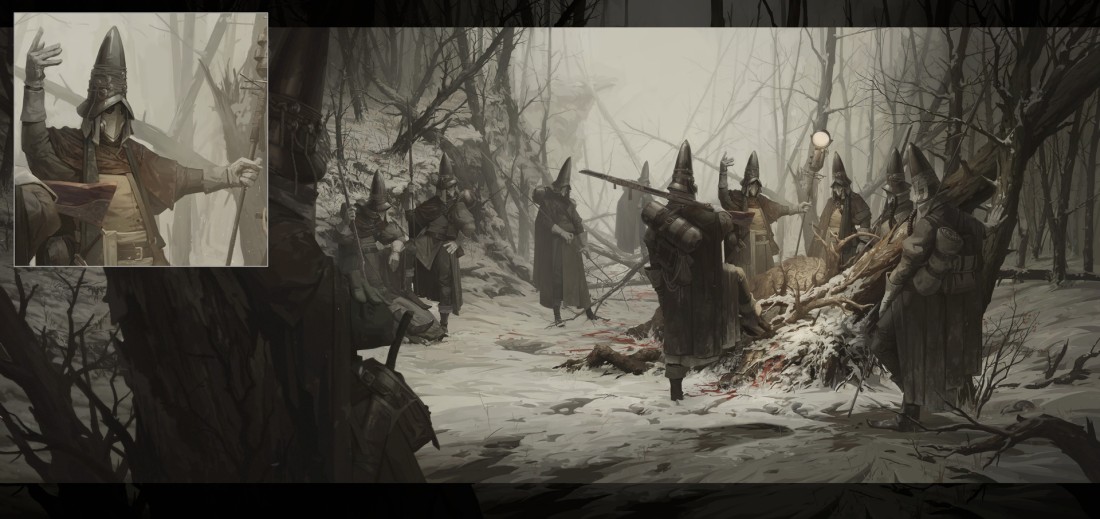
2) Charlie Bone 

Through the series of illustrations Nesskain has put up, Charlie Bone seems to be the story of a girl who has been brought up by a single father who was a fighter, and has raised his daughter to be exactly that. His illustrations describes the journey of this female fighter, Charlie Bone. The style of the illustrations in terms of the colours are also varying in nature.

An exceptional aspect rolling through these illustrations is the cinematic nature of these frames. The figures are energetic, their poise is strong and their posture reflects the kind of character they are.

3) Fourteen Golden Weapons 

This series showcases Nesskain’s true creativity. Anthropomorphology, being a very complex unit of character design where animals are personified with human traits, is handled radically well by Nesskain. Each of these characters are so believable in their traits, body structure, ethnic representations and colours, it leaves little doubt about Nesskain’s proficiency.

4) Harry Potter Illustrations

Illustrating a concept that has taken on the reputation of a world-wide phenomena is an extremely challenging task, considering books, movies and other forms of media has already been created in connection to these concepts. Nesskain however, has brought together a concept such as this, Harry Potter and created illustrations for it. Now I know not what these illustrations are for and if such a comic has actually been made and published, but these works are absolutely beautiful, from any consideration or point of view.

To begin with, neither the characters nor the ambiences hold any resemblance to the characters of the movie or the games. So Nesskain has brought a fresh feel to the storytelling of Harry Potter. And yet, every character is equally recognisable through features and body language. Compositionally too, the artworks are very emotive in nature and grows within the audience, a great feeling of nostalgia. Excellent character conceptualisation, amazing compositions and beautiful colours; this is definitely the best of Nesskain’s work, for me.

5) Overwatch 

The nation-wide phenomena that is Overwatch, would also be illustrated by Nesskain; first as Fan-Art and then officially through Blizzard for their cinematic trailers. The sheer action portrayed in this works are breath-taking and Nesskain does complete justice to the works. These works are guaranteed to bring sheer excitement to the lovers of the game and lovers of commercial art alike.

6) R.U.S.T. Comic

nesskain-hks-rust-01-page-6-by-nesskain-d79s2vanesskain-hks-rust-1-04-c-by-nesskain-d7dn2pgnesskain-hks-rust-ch12-by-nesskain-d9am8oenesskain-hks-rust-chapter-9-by-nesskain-d8v00vvnesskain-hks-rust-page-by-nesskain-da0mqasnesskain-hks-rust-random-page-by-nesskain-d7ae7u5nesskain-hks-rust-random-page-by-nesskain-d7bhuv5nesskain-hks-rust-random-page-by-nesskain-d7dwyxmnesskain-hks-rust-random-page-by-nesskain-d7p193jnesskain-hks-rust-random-pages-by-nesskain-d8hslxcnesskain-hks-rust-volume-2-by-nesskain-da0zkpj

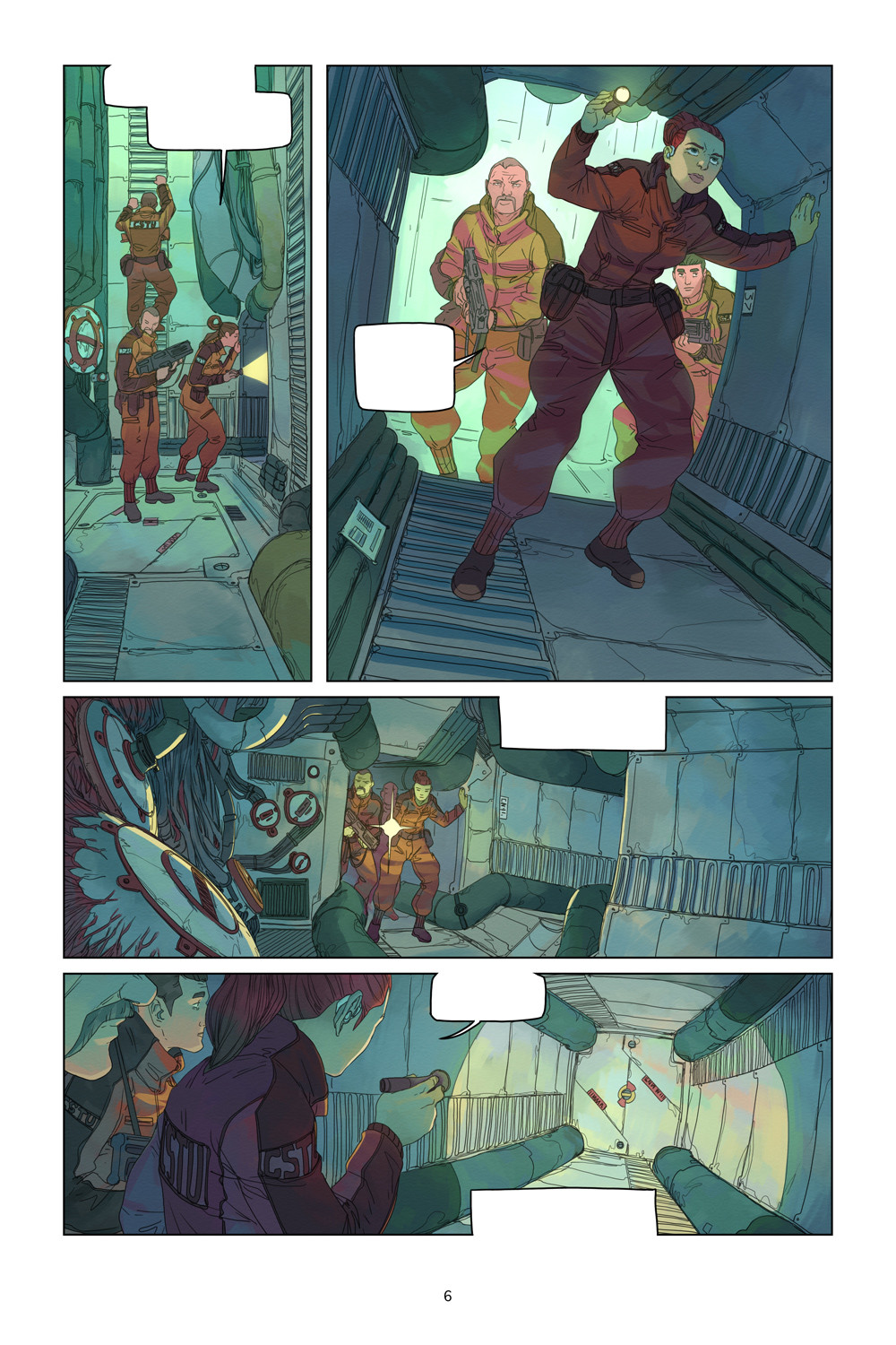
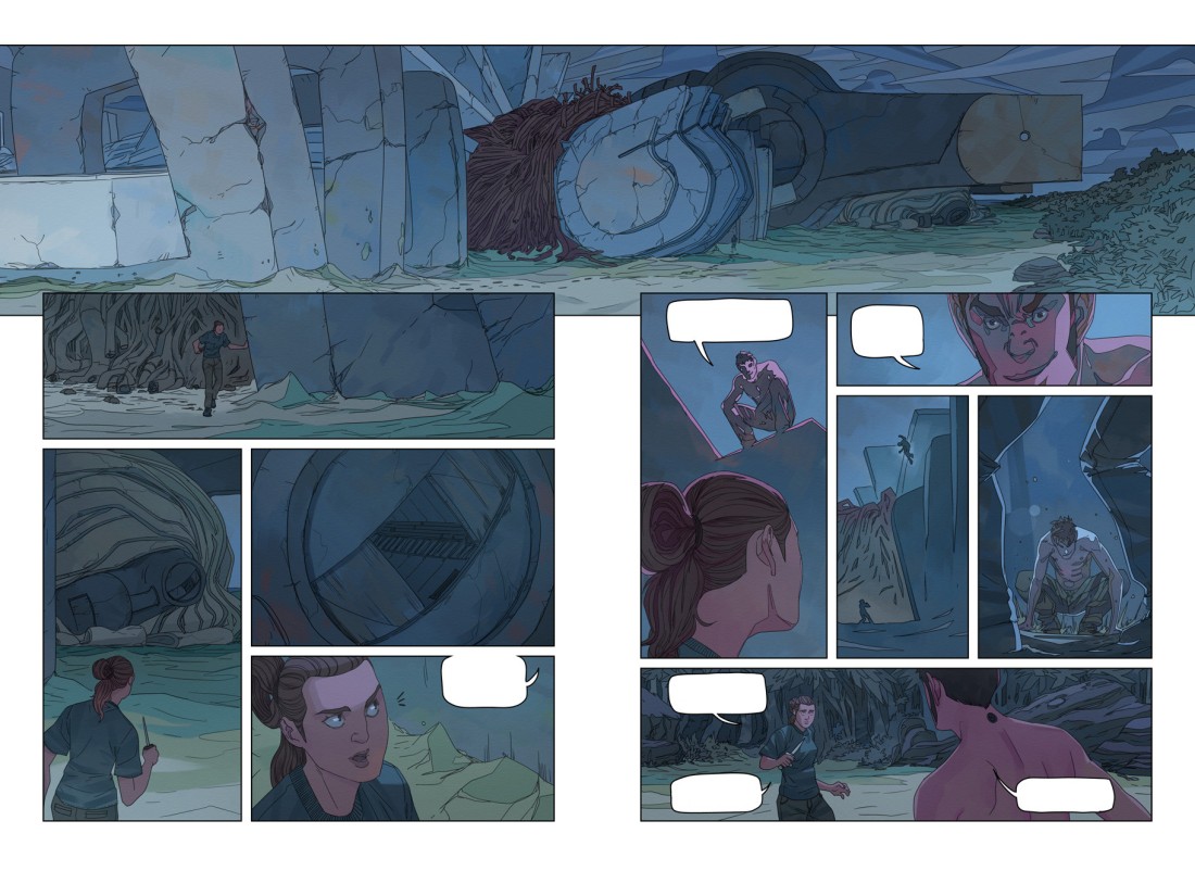
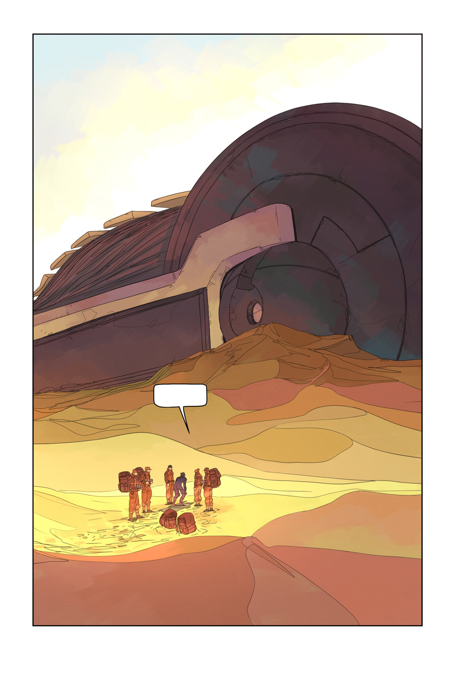
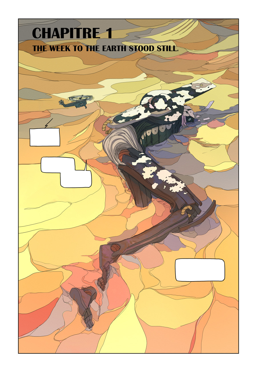
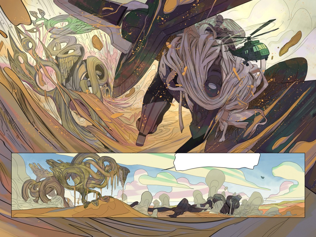
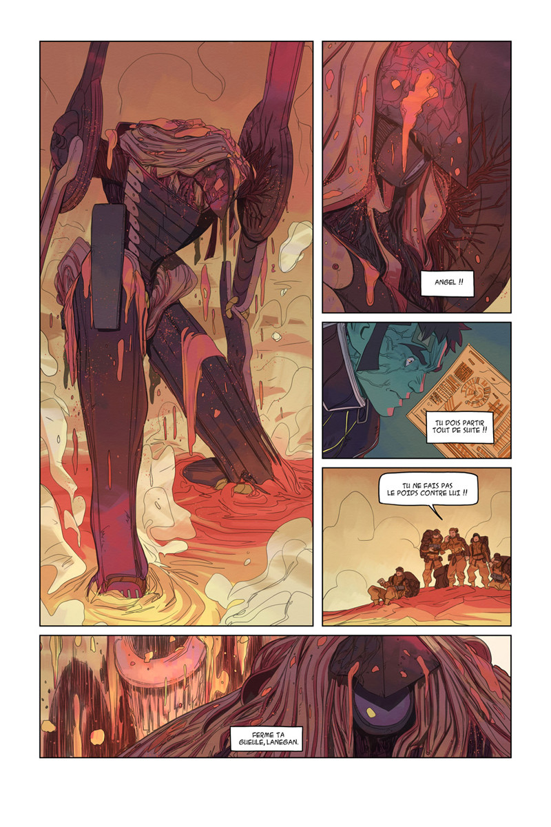
These are Nesskain’s comics page illustrations for the comic R.U.S.T. Nesskain has used a completely different colour palette as compared to his previous illustrations, sticking more towards desaturated and/or flat colours, rather than the sharp high contrast saturated ones. And yet, it still works and works so well, amplifying the dynamism as it flows through each of the pages. The panelling system is very simple but the content within the panels does not allow the readers to be distracted by the simplicity of the panel science in the pages.

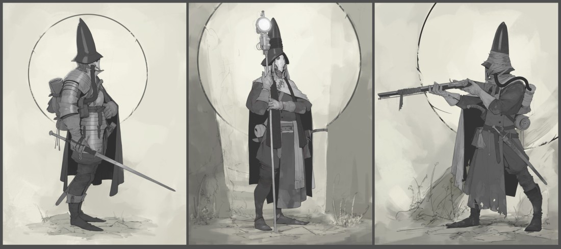
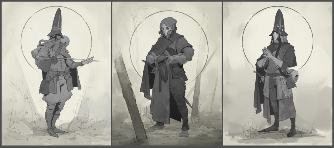
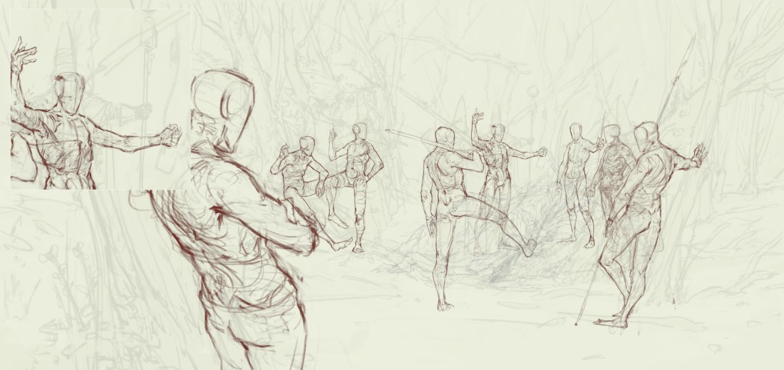
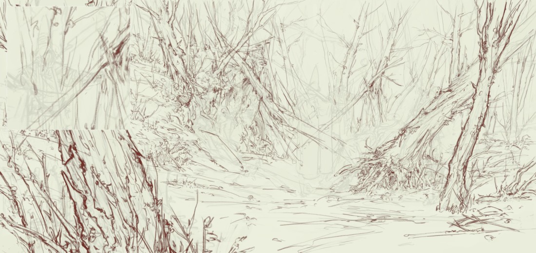
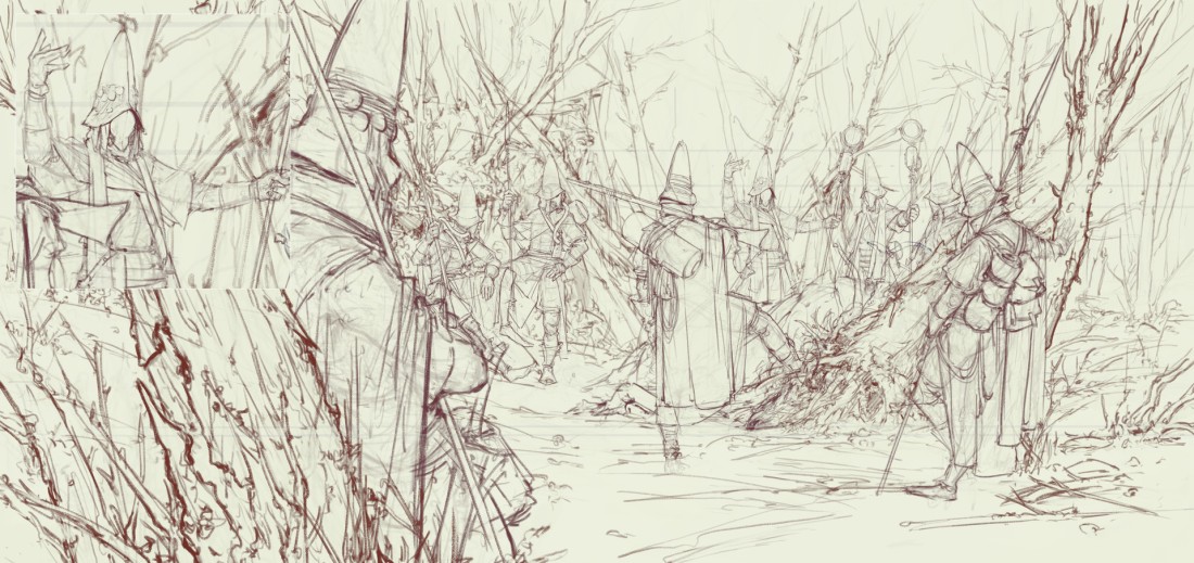
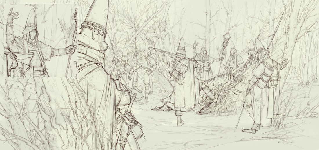
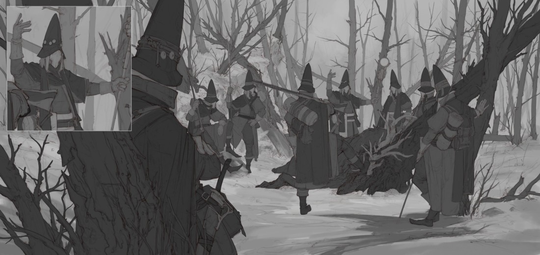
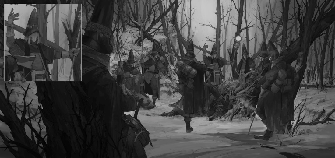
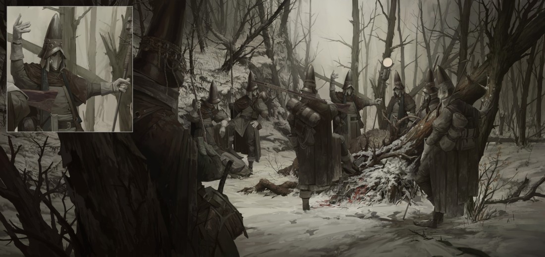
7) Work In Progress Steps 

Here I leave the last section of the article – The Step by step process of creation for the Nesskain’s illustrations.

This slideshow requires JavaScript.

This slideshow requires JavaScript.

This slideshow requires JavaScript.

This slideshow requires JavaScript.

If you like Nesskain’s awesome works, you can follow his works on the given links –

https://nesskain.artstation.com/

http://nesskain.deviantart.com/

https://twitter.com/nesskain?lang=en

http://nesskain.blogspot.in/

https://www.instagram.com/explore/tags/nesskain/?hl=en

https://nesskaintips.tumblr.com/

All the artworks displayed in the article solely belong to the artist – Nesskain Hks. We do not hold any claim to these artworks.


PREY Concept Art – Fred Augis

Concept Art for games is one of the vastest industries, when considering pre-visualisation as a core structure in the entertainment industry. It is an extremely challenging process of putting together visuals, dynamics and the physics of a game, even before it’s made. With the world-wide revenue of games reaching a whooping 91 Billion dollars this year, the task of visualising a game has reached a new level of significance, and for good reason.

Conceptualisation involves way more than just defining a few characters and backgrounds. It is an in-dept understanding of an imaginary world, it’s inhabitants and a story that binds all of this together. It is about being a third person understand the crux of this world just through a series of images and sometimes, simple animations, and as simple as it sounds through these words, the task is an endearing one.

To explain the colossal scope of this task, I took up the 2017 game PREY developed by Arkane Studios and published by Bethesda, and the visual creator behind this game, concept art extraordinaire, Fred Augis. Now, before I go into the nitty-gritty of the concept art, here’s a look at the trailer of the game.

Prey – E3 2016 Reveal Trailer

In Prey, the player controls Morgan Yu while exploring the space station Talos I, in orbit around Earth–Moon L2, where research into a hostile alien collective called the Typhon is performed. As the Typhon escape confinement, the player uses a variety of weapons and abilities derived from the Typhon to avoid being killed by the aliens while looking to escape the station. The player gains access to areas of the station through a Metroidvania style of progression by acquiring key items and abilities, eventually allowing the player to fully explore the station in an open world setting.

Now lets get to the concept art done by Fred Augis.

1) Character Portraits 

Augis maintains a very rough look in his portraits. He doesn’t compromise with face structures or the complexion of the characters and has detailed knowledge of efficient brush work. And as is evident, he is a master at creating variety. But he does not go into pushing his portrait into a picture perfect output. Concept art requires the artists to put forward their ideas in the most economical way possible.

2) Suit Designs 

These designs display Augis’ adept knowledge of anatomy, understanding of materials and how they fall on anatomy, sound aesthetic execution and professional presentation. But again, variety is key. To be able to put a multitude of options to the clients is one of the pre-requisite of being a good concept artist and Augis is a complete master at it.

3) Interior Designs 

This slideshow requires JavaScript.

Coming to interiors, Augis now displays his unparalleled understanding of perspective, colours, lighting and his eye for detail. The ambience created in these sketches are so believable, they seem right out of the actual game itself.

4) Prop Designs

Budding artists do not expect to be told to conceptualise props, whereas prop design is as important an element in concept art as character or background design. Again, Augis displays his impeccable understanding of materials, shapes, and these correlate with light and complex structures.

5) Weapon Designs

In the above sketches, Augis has not only designed the bombs but also shown the application, or how the user would activate the bomb, it’s physics and how it would react on it’s eruption. This thus displays how a concept artist illustrates the rules of the world he is assigned to create. And Augis, of course, does it magnificently.

6) Architectural Designs and Blueprints

Augis creates what looks like a hybrid of skyscraper and a spaceship for the space-station Talos I. He illustrates the materials used to create the space-station, creates variety for it’s design (Here as well!), and blue-print designs for small sections of the interior/exterior of the station.

7) Key Art Sketches

“Key art is the main image of a campaign that conveys the story and gets you to want to see the film in 3 seconds or less. Usually, there are several final images of key art used for a campaign, depending on the size of the film and marketing budget. Key art is used for many things.” – http://losangeleslink.blogspot.in/2010/02/key-art-art-of-process.html

To be precise, these are the roughs Augis created for the promotional artworks for PREY and the last three images are what Augis pushed to a closer version to being final.

8) Final Promotional Illustrations 

So these became some of the final promotional images for the game. As you can see, there is a stark difference between these images and the ones Augis created as the concept art. These seem more polished and also more experimented over, to create a beautiful aesthetic quality and add a ‘wow’ factor to it. Hints or 3D and Graphic Design elements are also a feature in these illustrations.

9) User Interface Illustrations 

One might not expect this but User Interface illustration is also something that seeps into concept art, especially in games. These of course, are simple and very straight-forward.

10) In-game animations 

These are simple but very interesting gif animations that Augis created as in-game features for PREY.


Fred Augis is a senior concept artist and a profound creative who has worked many big names like Dontnod Entertainment, Capcom, Ubisoft, Eugen System, Wizarbox, DTP Entertainment, Applibot, Bragelonne Editions, Gallimard and UDC Music. He is currently based in Rennes, France. If you like his amazing work, please follow him on the below given links – 

https://www.artstation.com/artist/fredaugis

https://www.behance.net/fredaugis

https://www.facebook.com/fredaugis/

http://fredaugis.deviantart.com/

http://fredaugis.tumblr.com/

And if you are looking for the creators and publishers of the game ‘PREY’ here are the links-

http://www.arkane-studios.com/

https://bethesda.net/en/dashboard

All the artworks displayed in the article solely belong to the artist – Fred Augis – and to Arkane Studios and Bethesda. We do not hold any claim to these artworks. 

Ash Walkers, First Hunt – Timofey Stepanov

Timofey Stepanov is a 21 year old digital artist based in Russia. For his young age, the artists is baking some absolutely incredible pieces of digital art. With incredible depth and complexity in his compositions, and noteworthy understanding of anatomy and a very subtle execution of colour, Stepanov’s pieces show an articulate understanding of bringing life into his work.

timofey-stepanov-9-re

Ash Walkers, First Hunt is Stepanov’s latest upload on Artstation and he has been gracious enough to breakdown his entire process, from start to finish, for creating this piece.

This painting striking for the immerse depth across the field of sight, the layers created to show this depth, the activity among the characters that pulls the viewer into the painting and the colours that are used. The trees all around the composition are used, not only in a brilliant way to create an isolating frame for the characters but also, as pointers to guide the viewer’s eyes around the composition. The weapons on the back of the character’s contribute to the effect of the trees. The point of highest contrast is where the hunt has taken consequence. It is also close to a position that dictates the Rule of Thirds, the diagonal aspect being the character closest to the viewer, leaning against the tree. Now let’s move on to the steps to gather a better understanding.

timofey-stepanov-character-comptimofey-stepanov-character-comp-2

1) Character Design 

Stepanov has designed these characters in a very straight forward fashion, concentrating more on constructing them than executing them to a finished product. The designs suggests his strength in line art, having created well proportioned body structures while keeping the physics of cloth and armour intact. The Steampunk nature of the sketches only adds to the design. Using mostly midtone values, Stepanov has managed to put forward the understanding of weight to the attire of the characters.

timofey-stepanov-3timofey-stepanov-4

2) Roughs 

A unique feature about Stepanov is that he treats the characters and the backgrounds separately. Having created the background first, Stepanov reduces the opacity of it to a minimal, and then starts fleshing out the characters; such that they interact with the background but at the same time, are not distracted by it. Stepanov’s proficiency with anatomy comes into play here. His initial lines are very flow-y and curved before he lays more concrete lines to create the distinctions of the body.

timofey-stepanov-5timofey-stepanov-6

3) Final Lines 

After finalising on the anatomy, Stepanov starts laying down the attire on the characters, focusing on the girth and width of the characters to lay the cloth, the straps, the bags and the wraps that they are carrying. On the top left of each of these frames, Stepanov has kept an inset of the Wizard-like character who is a little to the right of the centre of the frames. This would probably be to display the level of detail put on the character who is probably the farthest from the viewer. The folds depict that the cape is probably made of a heavier material like wool, while theirs shirts might not be.

timofey-stepanov-7timofey-stepanov-8

4) Greyscale Rendering (Values) 

Stepanov starts to move into the painting in these two frames, in keeping both the nitty-gritty and the bigger picture in mind. In the first frame he simply lays down the value of each element, much like in the character design. The flat values, in itself, distinguishes the nature of the characters, the nature of the terrain and the slight gradient in the extreme background has already started defining the field of depth.

The real action though, is happening in the second frame. The piece is now dominated by rough patches across characters and backgrounds alike. Multiple planes have been created through the use of shades and tones with the tree and the character closest to the viewer becoming a massive frame and a directive for the viewers eye. Dark gradients are creeping in from either side of the composition, which also helps in creating a focal point towards the place of the hunt. In the inset, we can see the amount detail Stepanov has put into the character at the back. But that could well be because he is closest to the focal point and most dramatic in his body language out of all the characters.

timofey-stepanov-11timofey-stepanov-12

5) Colour

Stepanov now moves on to colour and as is evident, he avoids any hue that might seem overbearing. He has tried to maintain the ominous vibe of the composition that he had achieved at the stage of the greyscale rendering. Sticking to mostly hues of browns and dulled out oranges, Stepanov has created a very earth environment while keeping true to the snowy landscape.

However, there is stark change of lighting and a sudden realisation of a focal point in the second frame. Stepanov has shifted the angle of the artificial light source, that being the light of the staff carried by the wizard character. In the previous frame, where the light source was pointing upwards and away into the composition and the ambient light across the composition was brighter and more diffused, in the second frame, the ambient light has decreased in intensity on a whole, and the artificial light now points down at the scene of the hunt, making this the primary focal point because of a newly achieved high contrast. Even you compare the insets of the two frames, you see that the wizard now looks brighter in the second as compared to a diffused first frame.

timofey-stepanov-13timofey-stepanov-14timofey-stepanov-15

6) Final Adjustments – Composition and Characters. 

Stepanov now makes some startling changes to the composition to create Balance. What was previously a crowded composition, Stepanov now pulls the canvas horizontally, and creates a segmentation between the crowd of the left and crowd on the right to give way to a plane field of sight and rest for the viewer’s eyes. He creates means for the viewer to glance through all the information rather than having to rush through everything, something that happened in the previous, crowded composition. One other thing this does is create a balanced visual weightage across the painting. Stepanov adds two more across the stretch he created, just to maintain the momentum of the painting. He has used the classic fog technique create distance in the painting but it does not overshadow the importance of the characters at any point. In the final inset, the detail on the wizard is nothing short of extraordinary.


Here are some more of Timofey Stepanov’s works. If you like his work, please do follow him at the links given below –

https://www.artstation.com/artist/timofeystepanov

http://timofeystepanov.deviantart.com/

https://vk.com/id172217564

https://www.facebook.com/mrfr2eman

All the artworks displayed in the article solely belong to the artist – Timofey Stepanov. We do not hold any claim to these artworks.